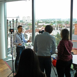
 James Rosewell being interviewed at the Digital Catapult London showcase
 Device detection and responsive design explained
James Rosewell shows me a colourful roll of paper that's the width of an iPhone yet well over three metres long. But this is no celebratory banner. When I look closer, I can see it's a printed copy of the Wall Street Journal's mobile website. That's a lot of scrolling to do... and a pretty unfriendly user experience for anyone reading the news online. Why does it work so badly?
Responsive web design is to blame, James tells me. This method of website creation – often summarised as a ‘mobile first’ approach – involves starting with a small screen, then automatically adjusting the layout depending on the screen size of the device you’re using. It means that users may see several columns with features and photographs if they visit a newspaper’s site on their laptop, yet can be shown fewer columns if they visit on an iPad, or just a single column when reading the site on a smartphone.
It’s pretty clever but, as the lengthy print-out demonstrates, it isn’t perfect. “What that misses is the context of the device and how the user's requirements change”, James explains. “So what you see with news organisations, for example, is websites like the Wall Street Journal, where you go to the home page and you're effectively scrolling through three-and-a-half metres of content in order to get to the bottom of the page. In that particular example, the user has two directions they can swipe by mobile phone: you've got the vertical and the horizontal. Often, with responsive web design, the horizontal is being lost. There's no reason why that should be.” And in addition, advertisers aren’t likely to be happy if their message is lost somewhere in the middle of an apparently endless reel of news.
Getting websites to react intelligently to their visitors is what James Rosewell’s company specialises in. He’s founder and CEO of 51Degrees, a Berkshire-based company that was founded in 2009. 51Degrees enables websites to know what device is being used to access their pages: not just the screen size but also key features – does it have a touchscreen, for example – and even the specifications of certain components, such as the graphics processor. As a result, website owners can tailor their sites to work perfectly for virtually every visitor.
This means that visitors on laptops, tablets and phones could each receive a version of the site focussed on their specific needs. James describes how a bike company might analyse which devices their customers were using when they visited certain parts of the website. “They may find there's a lower propensity for people to purchase expensive bikes on a mobile phone but there's a far higher propensity for them to purchase lower-cost accessories.” Armed with that information, the company can then optimise the products that are being displayed, targeting desktop visitors with bicycles to buy and mobile visitors with accessories “so they can improve the experience and therefore get more people checking out and spending money”.
In order to work effectively, this type of web technology requires up-to-date information about new or updated devices. In the past, it hasn’t always had a good reputation.
“For a long time, developers have been told that something called 'browser detection' is not a good thing to do”, James says. “Browser detection typically means you look at the version of the web browser - for example, it might be Chrome 38 - and you then say 'okay, Chrome 38 is capable of x but not capable of y. Therefore I may use technique x but I won't use technique y.’ Of course, the problem is that Chrome 39 comes out, Chrome 40 comes out, so this logic has to be continually maintained. Once developers have released their project or website to the client, they’re not necessarily engaged in maintaining that data. This is seen as a problem, and rightly so. It needs to be updated.”
51Degrees provides a simple solution in two parts. Firstly, it has a team of ten people that maintains a database of detailed device specifications, adding more than 200 new models every week. The 51Degrees device database now holds over 28,000 devices and 320,000 combinations of device, operating system and web browser: a true ‘device detection’ service that’s much broader than mere ‘browser detection’. Next, it makes it easy for businesses (and their developers or designers) to use this data, offering a choice of automatic updates or a cloud-based service. “On-premise deployment is quicker, because it doesn't have to go over the internet to get the information. A lot of larger organisations prefer this because it keeps the technology in one place, which is easier for them to manage.”
Despite the amount of information involved, device detection from 51Degrees is remarkably quick. “It'll typically take well under one millisecond”, says James. In fact, his top-end product currently runs at 0.0016 milliseconds. “The time taken to do device detection is miniscule compared to the overall time it would take for the other components to render a page. A cloud service is naturally going to have a slower detection time because the request has to pass over the internet and back again; typically that process takes 10 to 20 milliseconds.”
Rather than charging for the product, the 51Degrees device detection is free and open-source. “That's a very permissive open-source licence”, James points out, “you can use it commercially, for example.” There’s then the option of a free data file, updated monthly with new devices, or the choice of chargeable weekly and daily data file updates.
That could easily be the end of this story. A story of how good device detection can enhance the user experience and provide financial benefits for website owners. However, 51Degrees doesn’t just monitor the number of new internet-connected devices on the market. It’s also capable of counting the different devices that visit 51Degrees-enabled websites. “Businesses and developers can enable aggregated usage-sharing”, says James “and that information can then be analysed. It's all freely available on our website.” So, for example, you can compare devices or operating systems across continents or countries – Android devices in Europe, maybe, or screen sizes in India – and see them as a graph.
And James has another technological trick up his sleeve. “One of the ways we've started visualising some of that data is in a 3D rotation of the world, where you can go to digitalglo.be and interact with that data. You can see in which countries different device vendors are popular, you can see the usage rise and fall as the time of day changes, and then compare one vendor against the other.”
The 3D visualisation was built with the help of Robert Bateman, Founder and Managing Director of non-profit software company The Away Foundation. It took around five months to develop, using the AwayJS framework, and was first revealed at Mobile World Congress this year.
Their map shows the world as a globe with varying points of light shining out from each continent. Each point is a representation of genuine user data, with on-screen options to view anonymised information for different handsets, countries and time of day.
“It pulls out things which you might not necessarily notice by looking at data itself”, Robert explains, “so it's a nice way of getting a feel for where your customers are, or where the hot-spots are for the different handsets.”
The digitalglo.be project is certainly an impressive demonstration of web technology and the 51Degrees data source. But what about apps?, I ask James.
“My thinking is that the app is not long for this world”, he tells me. “The web browser - as you can see through the digital globe - is now capable of high-end graphics, it has all the capabilities needed to produce high-end games, so why use a native app? There's no real benefit. A simpler world is available through the web browser.”
First published on TheFonecast.com September 2015.

 RSS Feed
